When you’re trying to gather feedback, whether it’s from customers, employees, or a general audience, getting precise insights can be a game-changer. That’s where a well-designed 10 point scale survey comes in handy. Unlike simpler scales, a 10 point system offers a nuanced way for respondents to express their opinions, allowing for a broader spectrum of sentiment beyond just “good” or “bad.” It provides enough granularity to differentiate between, say, “pretty good” and “really good,” which can be crucial for making informed decisions.
Using a 10 point scale survey template can save you a ton of time and ensure consistency in your data collection. It gives you a solid framework, helping you formulate questions that are clear and unbiased, and ensures your results are easy to analyze. We’re going to dive into how to craft effective surveys using this robust scale and what makes a truly valuable template.
Crafting Your Survey with a 10 Point Scale
Building an effective survey goes beyond just picking a scale; it’s about asking the right questions in the right way. A 10 point scale, with its wide range, is perfect for measuring satisfaction, agreement, likelihood to recommend, or even perceived difficulty. The key is to ensure your questions are straightforward and directly related to what you’re trying to measure. Avoid double-barreled questions or anything that could confuse your respondents, as this can skew your valuable data.
One of the beauties of a 10 point scale is its ability to capture subtle differences in opinion. A 5-point scale might force someone to pick a middle ground, but a 10-point scale allows them to lean slightly one way or another, providing more accurate reflections of their true feelings. This precision is incredibly valuable for organizations looking to pinpoint specific areas for improvement or understand the depth of customer loyalty.
Labeling Your Scale Points
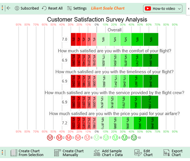
While the numbers 1 through 10 are universal, the meaning you assign to them is paramount. Clear and consistent labeling helps respondents accurately interpret the scale and provide meaningful answers. Generally, the lowest number (1) represents the lowest end of the spectrum, and the highest number (10) represents the highest. Here are some common ways to label your 10 point scale:
- Satisfaction: 1 = Very Dissatisfied, 10 = Very Satisfied
- Agreement: 1 = Strongly Disagree, 10 = Strongly Agree
- Likelihood: 1 = Not at all Likely, 10 = Extremely Likely
- Quality: 1 = Poor, 10 = Excellent
- Experience: 1 = Very Negative, 10 = Very Positive
Always consider your specific survey’s context when choosing labels. Sometimes, simply labeling the ends (e.g., “1 = Not at all, 10 = Very Much”) is sufficient, letting the intermediate numbers naturally imply degrees of intensity.
Furthermore, it is important to think about the neutral point, or if there even is one. On an even-numbered scale like a 10-point one, there isn’t a single “middle” number. This can sometimes nudge respondents to make a slightly more decisive choice rather than defaulting to a neutral answer, which can be a good thing if you’re looking for stronger opinions rather than ambivalence.
Making the Most of Your 10 Point Scale Data
Collecting data is just the first step; the real magic happens when you analyze and interpret the results from your 10 point scale survey. Because you’re working with numerical values, analyzing this data is relatively straightforward and can reveal powerful insights into patterns and trends. You can calculate averages, medians, and modes to understand the central tendency of your responses. For instance, a low average score on a satisfaction question clearly points to an area needing immediate attention.
Beyond simple averages, look at the distribution of your responses. Are most people rating you highly, with a few outliers at the bottom? Or is there a bimodal distribution, suggesting two distinct groups with very different experiences? Visualizing this data through bar charts or histograms can make these patterns immediately clear. For example, if you see a large cluster of 8s, 9s, and 10s, that’s fantastic, but if there’s also a noticeable bump at 3s and 4s, you know there are specific issues affecting a segment of your audience.
Another powerful application of 10 point scale data is trend analysis. By conducting the same survey over time, you can track changes in scores. Are your satisfaction scores improving after implementing a new policy? Has your product’s perceived quality gone up since the last update? This longitudinal data is invaluable for measuring the impact of your initiatives and making data-driven decisions about future strategies.
Ultimately, a well-designed 10 point scale survey template serves as a robust tool not just for gathering opinions, but for truly understanding them. It helps you quantify subjective experiences, turning qualitative feedback into actionable metrics. By embracing this level of detail, you empower yourself and your team to make more informed decisions, refine your offerings, and ultimately, foster stronger relationships with those you serve.
Harnessing the power of a 10 point scale survey allows you to move beyond guesswork and base your actions on concrete feedback. It provides the granularity needed to identify precise areas for improvement and celebrate specific successes, ultimately contributing to better strategies and outcomes.
Whether you’re gauging customer loyalty, employee engagement, or product satisfaction, the insights derived from a thoughtfully constructed 10 point scale can be a cornerstone of effective decision-making and continuous growth.


